Friday 10 December 2010

Evaluation

In what ways does your media product use, develop or challenge forms and conventions of real media products?

I have now completed all the tasks on this project and I am also quite happy with the outcome of my magazine cover and contents page, with this finished i have learnt the key items a student magazine needs to be successfull. It needs many different features to interest the reader such as articles about problems that relate to the age group that the magazine is targeted at, features like dangers of drink driving, drug abuse and passing your driving test, these features help the readers because they are at this age and can relate to this, plus they need the info. Other key ingredients include colour pages including many images to make the magazine look like it was worth the money and to make it look more professional, there can also be quizzes, competitions and games added in the magazine to make the readers become more involved in the magazine.

The front cover is the most important part of the magazine it needs to show the features it includes without telling too much information, it needs to be able to persuade the reader into buying the magazine. It also needs to have a interesting and attractive image on the front because this will also catch the reader and persuade them to read on. It obviously needs to include a masthead and a couple of lures these need to be in a interesting font because a simple font can link into the theme that the magazine has, and the masthead needs to be in large text because it is the name of the magazine and the bold, clear writing will make the magazine look ver professional and reliable.

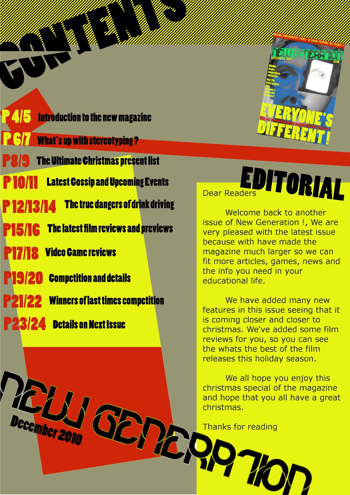
A typical contents page can include a few images linking into the features in the magazine, it also needs to include a clear view of the layout of the rest of the magazine, the reader can use this by skipping to the article they are interested in. It can also include different fonts again to make the magazine look interesting, to make it look even more interesting you can put the titles verticly or on an angle to use space better.

I have including many of these features in my magazine, for example on my front cover I have added a couple of lures showing some features included in my magazine like quizzes and games, also articles like the main banner which shows one of the main articles in the magazine, for example mine is on stereotyping and how this can be a problem. I have also used large text for the banner and the masthead like most magazines this makes it look more official and makes the layout look like its been well thought out. I have done a few features differently like in my magazine unfortunately i do not have any images linking to the articles in the magazine but i have used a small image of the front cover above the editorial as a introduction to the magazine, i have seen this done in many different magazines. In my research I have looked at many differnet student magazines including one from my own college, they are different in a few ways mine seems to have a bold masthead while the other has a masthead that looks like kind of a animated title with some added effects to make it look like it was written and designed by students, which it actually is.

How does your media product represent particular social groups?

I have represented teenagers by making my magazine look much more modern and stylish to fit in with the teenagers today, it also has a cover picture which is made from three different teenagers faces which i thought would work quite well but i'm not fully happy with the front cover some of the colours seem a bit too tacky. I have represented the students by adding features that help and relate to them such as the feature in mine whic was stereotyping. I have used not as images as i hoped unfortunately i do not own a very good camera but i did have a few great images taken with a friends camera which made my cover very interesting. Unfortunately with the lack of images on my contents page the ratio of text to image is quite high, so i wish i had used more images on the contents page this is something i will have to improve when i get another project similar to this.


What kind of media institution might distribute your media product and why?


My magazine offers help to the students with issues they have to live through in modern day life, this is why a magazine institution would be interested in my magazine. It also offers many great features and information they will need, we already have a student magazines which already offers some great stuff but mine is very similar it has many great articles and the layout that i created works well I think.


Who would be the audience for your media product?


The audience for my magazine would be the students of course because it has the information and features that we usually find very interesting in magazines.


How did you attract/address your audience?


Someone would want to buy my magazine because well it relates to the difficulties that they go through and it has many features they will find interesting, i have made the front cover feature an image which includes students like the readers themselves so that they can see that the magazine has been written by students like themselves.


What have you learnt about technologies from the process of constructing this product?


I have learnt alot in this project especially using the programs on the computers to create and mess with all the things i need for my magazine cover and contents page, i have also learnt the features and images that a magazine needs to be a great magazine. I have used a few different programs including Corel Photoshop & Gimp for the images and contents page setup, i also used Windows publisher and word for some of the layout designs for the pages. For the images to be put on the computer i used a mobile phone and a digital camera for some other images so that i could later adapt them on photoshop. I must also mention the help that i have had from fellow media students and thank them for all there suggestions thay have given me.

Final Contents Page Design


This my final design for my contents page, I'm quite pleased with it and i believe that the colours work very well together. I wanted to get quite a modern look for my student magazine without making it look cheap and unprofessional, i'm not sure if i have done this but i would really like it if you would comment on it to share your own views.

Wednesday 8 December 2010

Designs for magazine cover

First Draft


This was my first draft for the magazine cover but i believed that the colours did not work well together so i decided to change the colours and make the picture in the background much more effective. I may use the same layout though because i am happy with how i have placed all the features on the front cover. For my magazine masthead i decided to use the font that the comments suggested i believe they liked this one because of its modern look it matches the kind of style i'm trying to get.


Final Design


This is my final cover design for my magazine, i'm partly happy with it but there are issues that i would like to improve, i will explain these in my evaluation. Please comment about it, i would like to hear your own views.

Friday 3 December 2010

Masthead Designs

For my masthead designs i wanted a font with a modern look to it, i have chosen these few because they all look quite bold and interesting. I don't really have a favourite but i don't mind which one i use so please comment on the one you like the best and i will most likely use the most popular.


Friday 26 November 2010

Cover and Contents Designs


This is my first front cover design for my magazine.


My second design has a few differences including text which is on an angle which i believe makes it more interesting and decorative for the reader.


My first contents design.


My second contents design again has a few differences, and has one added image.


Wednesday 24 November 2010

Textual analysis of other student magazines


For my first textual analysis i decided to do it on this issue of 'First Car', it has many great features on its front cover. Firstly, you can see the strapline at the top of the magazine showing what is included in the magazine in this case its 'competitions, games, gadgets etc, the typical features you would find in this kind of magazine. Secondly, you can see the masthead close to the top of the magazine its in bold white lettering and is set in quite an urban fashion with a simple font that works quite well because it fits in with the theme this magazine has. Another feature the front cover has is the banner just below the centre of the magazine this is important to the magazine because it links to the image thats on the cover, its showing an interview with stars of a popular television show so its in bold writing dominating the magazines cover, it could also be said to be a caption in some way. Near the bottom of the magazine you can see the cover lines which sum up many of the features that will appear in the magazine, it uses the space on the cover well and the pictures make the cover more interesting to the reader. Near to the bold name of the magazine you can see a set of lures these are used to show the features in the magazine and by using only a little part of the feature this will persuade the reader to purchase the magazine, hense why there named lures.


This magazine is 'hc', which to me is not as well layed out as the first magazine it also doesn't use graphics as well as the other one either but it does have some good features. It has a masthead like all magazines should have but the font used is not as interested as the 'first car' magazine in my first textual analysis, its quite plain and has a solid colour behind it which isn't as interesting as the layout of the first magazine. The magazine also does not have many features being shown on the cover it has a banner at the bottom of the cover showing some features inside the magazine but other than that there is a feature about education which has some interesting animated pictures but overall the magazine does not use the techniques the first magazine had.


For my last textual analysis i chose this magazine named 'Smart talent', this magazine uses its features much better than the magazine before it, it has a picture which is used in the background to make the cover more interesting but i have noticed that her head seems to cover the masthead i've seen this done on many other front covers in newsagents and i find it to be a little annoying because i can then not read the entire masthead but others find it to be a great effect, which it is but it can sometimes make the magazine look unprofessional. It uses text in a unique way with the 'smart' in the title being verticle, it shows features at the side of the magazine which can be used as a lure it also has a website at the bottom which can make the magazine more reliable.

Contents Pages


  • This is a contents page from another student magazine, its actually from the 'hc' magazine i did an analysis on earlier.
  • It uses colour and graphics to great effect making this page much more interesting and professional.
  • Its well layed out and has an introduction to the magazine under the heading 'welcome to the magazine', this is something i may do in my own magazine because it seems quite professional and a great feature to have.
  • Theres three columes, that show all the features clearly.
  • It also has a picture of the actual magazine cover at the bottom of the contents page, this seems like a great idea to do, i may do this in my magazine.


  • This contents page is layed out differently to the other it uses simple colours and illustrations.
  • It isn't as well layed out as the contents page before it because it doesn't use as many columes for the magazine, it still works but it could have had many more colours and features.
  • It has a picture of one of the authors which is quite a nice touch to the magazine, i may use this in my magazine.
  • It also has a large article just about the editor this is quite a good feature is well,  it makes the magazine seem like it has had alot of work put into it.


Friday 19 November 2010

Comparison of other student magazines

The first magazine I looked at was ETC: Education/Training/Careers, it is very well presented and the cover is glossy to make it look high quality compared to all the normal paper magazines that look tacky in my own opinion.

  • It has many articles on careers like the royal navy, music and computer games developement because students will need information on career options.
  • It is well presented, quite high quality. It uses a variety of colours on each page to make the magazine much more well presented and exciting to the reader.
  • It also give information about problems the young have these days including alcohol, safe driving skills and laws. There are adverts in the magazine as well as competitions for the readers.
  • Front cover and the contents page are both  layed out very well and do not look tacky and overly colourful, everything seems to work and the images make the pages much more interesting to look at. Its perfectly layed out just like any other magazine you would buy from a newsagaents.
  • There are contacts and authors displayed in the magazine so you know that the magazne is quite official, i will make sure to do this when created my magazine.
The second magazine i looked at was First Car: Magazine for young drivers, which is a magazine for young motorists.
  • It isn't as high quality as the magazine before it but it still has a glossy front cover which makes the mag seem better quality, It has a front cover that seems at little overcrowded and colourful and this causes the magazine to look a little cheap.
  • Inside the magazine there is a well layed out contents page which uses a font which links into the theme that the magazine has throughout, It also has pictures that are well layed out with the text so it works well without making the page look to crowded.
  • It also contains contacts which makes the magazine seem much more reliable and trustworthy with the information it shows.
For the third magazine I looked at a copy of Smart Talent, which is a magazine for young students searching for careers.
  • Firstly, the front cover is glossy making the magazine look more professional.
  • Images are used well but the cover uses only eutral boring colours, it works but it could of been made to be much more colourful.
  • Interesting fonts are used on the front cover which makes it look more professional and interesting to look at.
  • The womans head on the front cover does cover the magazines title and this does aggravate the reader, this could be improved.
These magazines show me how my magazine could look at the end of this media project if I work well and research.

Wednesday 17 November 2010

Action Plan

My first task is to create a student magazine.  My action plan shows what I need to do in the four weeks I have up until the deadline on the 10th December, there are many tasks that need to be completed before this deadline and this is how I shall complete each task:
  •  Week 1: 15th November 2010 - Creation of my blog, write action plan, comparisons of other student magazines, textual analysis of other student magazines.
  •  Week 2: 22nd November 2010 - Audience questionaire (1 cover, 1 contents), create cover and contents.
  •  Week 3: 29th November 2010 - Organise photo shoot, draft pages
  •  Week 4: 6th December 2010 - Audience feedback, evaluation