Wednesday, 9 March 2011
Contents Page (2ND DRAFT)
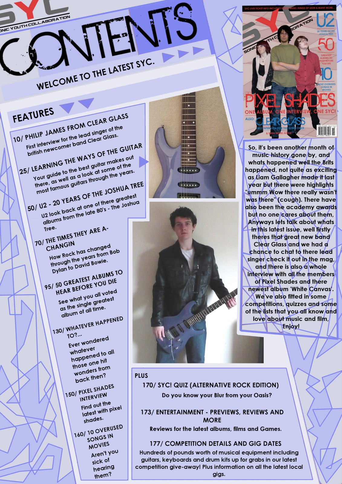
For my second draft I tried the colour change idea I had, I decided to change it to blue and I quite liked the outcome but it is actually difficult to choose between the two because I like the blue version but I also like the red version is well. I still have to see how it will look if I change the angle of the images to match the contents list, I will do this in my next draft.
Contents Page (1ST DRAFT)
This is my first draft for my contents page, I'm quite happy with it but I may try to change the angle of the images to match the angle that the contents list is on, I may also try a different colour scheme like a light blue similar to my Double Page Spread.
More Photos (Maybe used on Contents Page)
I'm planning on using these images of a guitar for a feature on my Contents page, I may also use some of the previous pictures for the other features including the 'Clear Glass' interview.
Friday, 4 March 2011
Double Page Spread (3RD DRAFT - Final)
For the final draft of my double page spread I finally fixed all of the mistakes and even added some extra things including an anchor to go with the image of the band member. I also added a coloured background which I think works really well, I also changed the postion of the 'Clear Glass' text beneath the main article ,I changed it so that it was inline with the article and yet did not effect the black text that the article is in. I have also sorted out the problem with the image it is no longer stretched vertically and fits in well with the strange angular shapes I have used for the background.
Thursday, 3 March 2011
Front Cover (2ND DRAFT - Final)
For the second draft of my front cover I changed the confusion of the images as well as adding some more text on another band, I also changed some of the pink writing into a light blue colour which I think has worked really well. I also added a background which I created by filling colour within all the various lines, I think its worked well but I may change the colour, perhaps a blue may look good but this may mean that I have to change the blue text back to red or maybe a new colour all together. I think after experimenting with a few different colours, that adding to many colours is going to cause the front cover to look too tacky so I may leave the cover as it is because I am happy with the outcome of it.
Wednesday, 2 March 2011
Front Cover (1ST DRAFT)
This is my first version of my front cover for my media magazine, i'm quite happy with it but I believe I should add a background colour of some kind because there seems to be a large empty space above the images. There is also a problem with the images, the front cover shows the images to be the members of 'Clear Glass' but inside the mag on my double page spread i've used a different image of another person which is a little confusing. I also may change the colour of some of the text because it is mostly a pink/red mix, I may add blue and see how this looks.
Double Page Spread (2ND DRAFT)
This is the second draft for my double page spread, I much prefer this version because I believe the colours work much better together. I also changed the image because I have decided to use the other images on my front cover instead, I think they would fit much better on the front cover because they are all in quite dramatic stances which you see alot on front covers of other well-known music magazines.
Subscribe to:
Posts (Atom)


