Friday, 11 March 2011
Evaluation
Evaluation
• In what ways does your media product use, develop or challenge forms and conventions of real media products?
To me there are many key ingredients for a great music magazine; being a reader of quite a few different media magazines myself I find there are a few features a magazine needs. Firstly, it needs to have an interesting font that not only looks great but fits in with the magazines theme and style, for example if it was a magazine much like Kerrang it would have quite a disturbed and eroded font that looks quite dark and gothic, then you have modern magazines like Q and NME which need to fit in with the alternative rock and pop music of today so the fonts will be quite plain looking much like Georgia or Times new Roman typefaces. Secondly, a cover needs to have a interesting image like of a new band or perhaps an older band but it needs to have something unique about it like for example on many Q magazines you have images where the lead singer is in the rain or some other situation, so the rain is used as an interesting decorative quality on the cover, or you can also use flares that give you a realistic sparkle or shine as if your stood in the sun, this can both be done with a camera or you can edit the image and add a flare later. Furthermore, a front cover needs to have a colourful yet professional masthead that can easily become well-known and famous much like Q that is both easy to remember and not too long, I believe some of the best examples of mastheads are abbreviations or simply letters like Q, XXL and NME because they become so well known very quickly. A front cover also needs to include a few features to act as lures as well as a main headline, the main headline should be in bold capitals to make a great effect as well as interest the consumer, this can also be in a different colour to stick out as the main feature. Other than the main headlines it needs a few lures is well, again to interest the reader, these lures can include competitions, quizzes, interviews and reviews that all persuade the reader that the magazine is value for money.
The average contents page is usually quite colourful in many different music magazines, it obviously contains quite a lot of text but it also needs to show a few images to look effective and professional. When it contains an image it usually has a quote from that particular feature, this is quite an effective and decorative thing that many magazines do. You also have the feature list with the page numbers; this can also be laid out in quite an effective way like on an angle or even above an image that acts as a watermark for the text. Another simple effect to use is to change the colour of some of the text, a colour that matches with the magazines colour scheme. Other than this an average contents page usually contains a lot of images but not too many because in my opinion magazines like Kerrang have too many images on their contents pages and because of this they start to look tacky and cheap.
A double page spread usually has quite a lot of text because they are usually interviews or features of bands from the past and present, so it needs to feature a few images or even just one because some magazines use the one page for just one whole image while the other page consists of just text, an effective technique that some magazines do is add a quote to fill in an empty space or sometimes they even place the quote going straight across the page as well as the image. Other than this the double page spread can also feature captions which go with the images as well as the actual article which is usually laid out with the grid effect that actually looks quite good but I quite like trying something new and laying out my text in an effective and imaginative way.
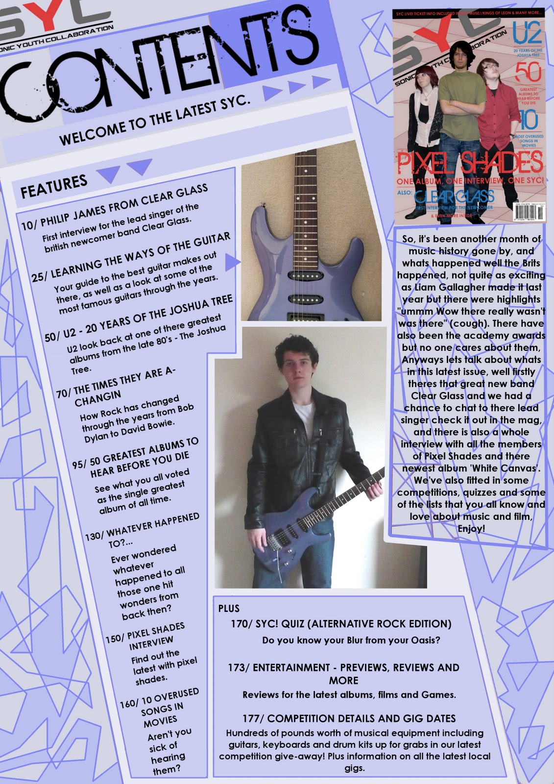
I have included many of these conventions in my music magazine, firstly for the front cover I definitely needed to come up with a main headline and a few lures, so I added the main headline which I decided would be a band interview and this would go straight across the page as well as anchoring the images that I would later take. For lures I added some of the typical features you would have in a music magazine like looks into the making of great albums, lists of the public’s favourite bands and interviews with other well-known bands. I also needed to design and come up with a masthead so I needed something catchy, colourful and overall easy to remember so I came up with SYC which stands for Sonic Youth Collaboration which means both the public and the magazine editors contribute to the final magazine, I knew that I needed to make the logo for this quite simple yet classic so I simply had the letters with the text placed beneath it in the same font. For my contents page I knew I had to include a couple of images but the thing I was worried about was the overall layout of the page I didn’t want the typical grid effective that I found to be both boring and plain I knew what I wanted but I had a feeling that if I didn’t get it right it may have been consider as tacky and unprofessional. So to make my page more interesting I decided to place a lot of the text on an angle as well as the logo and the title I think it worked quite well but the colour scheme was difficult to get right but I believe I achieved it in the end. Finally, my double page spread was actually to me the simplest of the three I knew I needed to take a few images of what looked like average band members and I also needed to decide upon a font and colour scheme but again the layout was what I wanted to definitely get right. With the double page spread I wanted to not use the average grid effect again but to try and make my page as unique as possible, so I placed the main title beneath the article to get this unique way of using space I believe this worked incredibly well and when I later added the image I was very pleased with the outcome of the pages.
I believe I’ve pushed the boundaries by using my own way of laying out my pages, I didn’t use the average grid like so many magazines do these days, I find that by coming up with you own design you’ve really put a lot of effort into and really thought about what makes a magazine great.
• How does your media product represent particular social groups?
I have definitely represented teenagers you can tell by the colour scheme and images on my magazine pages, but there is not a definite genre of music that I have represented I think I have represented a mix of genres which are alternative rock and some modern pop music. I think I have represented them well, I have taken photos and chosen fonts that fit in with there modern lifestyle, like you see in Q magazines the photos that I have taken are all in quite dramatic or quite neutral poses like the example shown the pose is like this to make the magazine seem much more personal as if the singer is staring straight at you.
The image shown is one of the images I used in my magazine and I believe it really fits in with the look of my magazine because it relates to the target audience because he’s quite young only just starting his career in music, this relates to them because they are in the same position there studying for the lives ahead of them and they want to see some one similar to them to fill them with hope that they can do this too
.
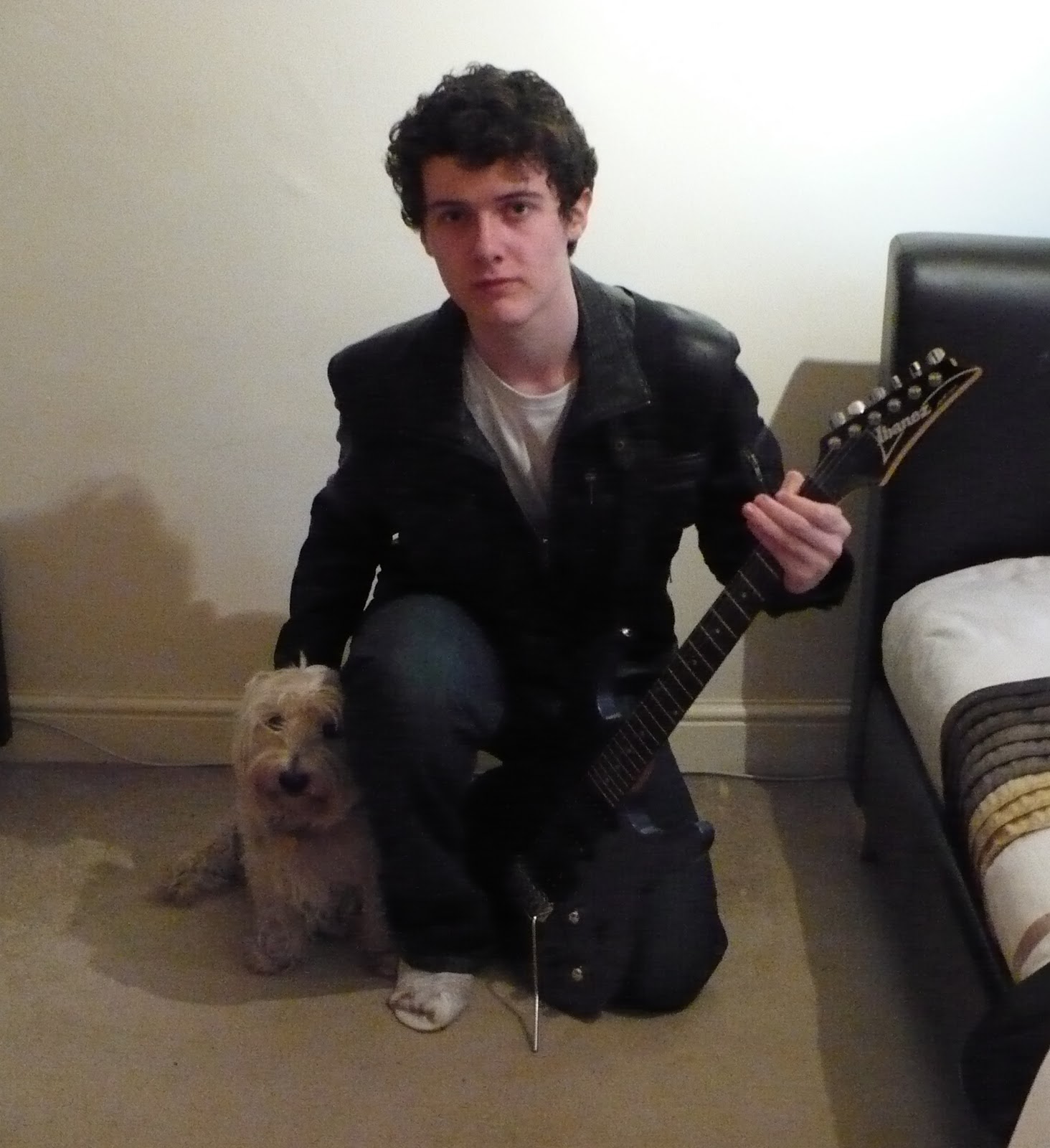
The language I have used can also relate to them because it is quite informal as if I am speaking straight to them in their kind of tone. The ratio of pictures to text is also not to over the top for them is well because to much text can be seen as intimidating while to many pictures could be seen as insulting.
• What kind of media institution might distribute your media product and
why?
Bauer Media Group publish Q magazine which is the magazine that I was aiming to be like, they maybe interesting in my magazine because it is much like Q but it is a little more colourful it also features similar bands to Q but if my magazine is too similar to Q they may not be interested in it because they already publish Q monthly and my magazine may become a competitor and may reduce the sales of Q if popular enough. Bauer also publish Kerrang is well which again would be a disadvantage because my magazine would never stand a chance at becoming popular against two very well known magazine publications. Another magazine publisher is IPC Media which have published NME weekly since the mid 1960’s, they maybe interested in my magazine because I offer a down to earth magazine that would only be published every month but would contain a lot at quite a low price but again this may prove difficult against NME magazine which has being going since the early 50’s. My magazine could stand a chance though because it can be read by teenagers from the age of about 16 to 19 which is quite a decent space; it also has a very different style to a NME so it may be found as much more modern and sophisticated because it talks about both new and old bands.
• Who would be the audience for your media product?
The audience of my magazine are between the ages of 16-19, which is the age where they are starting all of the serious work in college and planning for their futures, my magazine offers them a getaway from all the stress of collage by simply reading through all the newest news in the music industry today and it is only monthly so it doesn’t act as a distraction from their work. It can also be read by a younger audience to because it doesn’t contain any bad language that some music magazines have today.
• How did you attract/address your audience?
Well referring back to my audience feedback I can tell that people liked my magazine for my interesting layouts which is a point I was aiming for and I am quite happy with this. The thing that I was surprised about is the fact that some people were not very impressed with my colour scheme but opinions can differ between others. The most important point of attracting your target audience is obviously the front cover, it is the part where the whole magazine is summed up within this A4 space and I knew I needed to create an effective front cover to achieve this. I included informal language to address my audience as well as a attractive colour scheme that some didn’t like surprisingly but then again there’s always something to improve. Other ways to attract the reader is adding the features and lures on the front cover these are a very important part of the front cover because they attract the reader especially a feature that they are extremely interested in. I think people would be interested in my magazine because it offers focuses on both new and old bands so they can learn a lot about bands from the past, they would also be interested in my magazine because its modern and stylish so it relates to there lifestyle and not past even though features do focus on the past from time to time.
• What have you learnt about technologies from the process of constructing this product?
There are many technologies I used on this project some that I have only just been introduced to in my college year starting with Gimp which is the art program I used to create all of the pages for my music magazine, I was only introduced to it a few months ago but being an art student I have got the hang of using the program incredibly quickly and now I am very good at creating posters and pages for magazines on it. There were many new techniques on Gimp that I found while working on my pages one being all of the effects like Predator and cubism I didn’t use these examples but I did use the brightness and contrast tool that I was introduced to.
Another piece of technology I also used on this project was the digital camera which I needed to take my photos and record my responses from the audience with, I have only recently brought a camera because I now need it for all of my lessons but now by using it a lot I’ve really got used to how to use it and can now take decent photos for my future projects.
I have also used Microsoft word which I think everyone should be familiar with. Word has always been a great program to use because it is away of avoiding the messy look of my fast handwriting.
The last thing I’ve used is the blog which I have also been recently introduced to in my first college year, it’s actually a very good program because it basically is an electronic diary and it works brilliantly, obviously I’m still learning how to properly use it but I’m a fast learning and I can only improve at using this program.
• Looking back at your preliminary task, what do you feel you have learnt in the progression from it to the full product?
I’ve learnt many things in this project from using Gimp better to using blogger more, but the most I’ve learnt is when I was creating my pages. Looking at magazines like Q and NME showed me how good I could make my music magazine by taking some inspiration and incorporating my own design ideas I made my music magazine look as good as I could. I’ve also of course learnt a lot on the media side of things, how making your front cover as effective as possible could effect the sales of your magazine. I’ve also learnt a lot about design through looking at layouts of pages in other examples and by looking at complimentary colours and how they can affect the style of my magazine, so with this project done I should keep all this knowledge with me and projects in the future should be looking even better, thank you for reading.
Wednesday, 9 March 2011
Contents Page (2ND DRAFT)
For my second draft I tried the colour change idea I had, I decided to change it to blue and I quite liked the outcome but it is actually difficult to choose between the two because I like the blue version but I also like the red version is well. I still have to see how it will look if I change the angle of the images to match the contents list, I will do this in my next draft.
Contents Page (1ST DRAFT)

This is my first draft for my contents page, I'm quite happy with it but I may try to change the angle of the images to match the angle that the contents list is on, I may also try a different colour scheme like a light blue similar to my Double Page Spread.
More Photos (Maybe used on Contents Page)


I'm planning on using these images of a guitar for a feature on my Contents page, I may also use some of the previous pictures for the other features including the 'Clear Glass' interview.
Friday, 4 March 2011
Double Page Spread (3RD DRAFT - Final)

For the final draft of my double page spread I finally fixed all of the mistakes and even added some extra things including an anchor to go with the image of the band member. I also added a coloured background which I think works really well, I also changed the postion of the 'Clear Glass' text beneath the main article ,I changed it so that it was inline with the article and yet did not effect the black text that the article is in. I have also sorted out the problem with the image it is no longer stretched vertically and fits in well with the strange angular shapes I have used for the background.
Thursday, 3 March 2011
Front Cover (2ND DRAFT - Final)

For the second draft of my front cover I changed the confusion of the images as well as adding some more text on another band, I also changed some of the pink writing into a light blue colour which I think has worked really well. I also added a background which I created by filling colour within all the various lines, I think its worked well but I may change the colour, perhaps a blue may look good but this may mean that I have to change the blue text back to red or maybe a new colour all together. I think after experimenting with a few different colours, that adding to many colours is going to cause the front cover to look too tacky so I may leave the cover as it is because I am happy with the outcome of it.
Wednesday, 2 March 2011
Front Cover (1ST DRAFT)

This is my first version of my front cover for my media magazine, i'm quite happy with it but I believe I should add a background colour of some kind because there seems to be a large empty space above the images. There is also a problem with the images, the front cover shows the images to be the members of 'Clear Glass' but inside the mag on my double page spread i've used a different image of another person which is a little confusing. I also may change the colour of some of the text because it is mostly a pink/red mix, I may add blue and see how this looks.
Double Page Spread (2ND DRAFT)

This is the second draft for my double page spread, I much prefer this version because I believe the colours work much better together. I also changed the image because I have decided to use the other images on my front cover instead, I think they would fit much better on the front cover because they are all in quite dramatic stances which you see alot on front covers of other well-known music magazines.
Thursday, 17 February 2011
Double Page Spread (1ST DRAFT)

This is my first draft for my double page spread. I'm quite happy with it but there is something about the images that I don't quite like, it maybe the lack of shadows behind the images or I think it might be that the colours don't quite work together well. For my second draft I may change these to see how other colour schemes work on this page.


For my double page spread I wanted to place the main text in an interesting and effective way much like these examples above from Q magzine. For the 'Clear Glass' text on my page I decided to place it beneath the main interview in a different colour to create this very effective use of space on the page. I believe it worked extremely well and I was very pleased with the outcome, but again I may change the colour and it's position to see how it looks then.
Wednesday, 16 February 2011
Photo Shoot 1 (Double Page Spread)
These were the first couple of pictures I took for the double page spread, for the actual page itself I removed the background using the picture programs on the college's computers. They came out quite well but I will definitely need to take a few more for my Front cover and Contents page.


Monday, 14 February 2011
Written Interview for Double Page Spread
This is my finished interview that I will use on my final double page spread, I'm quite happy with it and I have plans on how I'm going to lay it out, hopefully it will work well.
With one of the best albums of the year and having two songs in the top 40 ‘Clear Glass’ insist that they have not hit their target yet and according to Philip James who we caught up with at his London home there plans for their next album will blow us away and we have no doubts at all. According to everyone they are the latest and greatest to come out of Britain
Philip James has had a revelation; he knew he was born to make great music and keep alternative rock alive, we caught up with him to talk about his achievements so far and his struggle to make his incredible debut album. On a cold afternoon in mid January, in a London apartment we all chatted to Philip about his career in music so far, his inspirations, his beginnings and what he was planning for the future. Unfortunately, the other members of the band were busy on the new album and he was staying a while to chat to us.
‘Clear Glass’ born out of the alternative sound of the 1990’s are the best newcomer band for a long time but will they persuade us even more that they are the band to be excited about. With the slight hint of cigarettes covering Phil, we got started for a long and perilous interview.
When did you first get interested in following a career in music?
Being a child of the late 80’s, I got into all the great British music of the 1990’s starting by listening to stuff like Blur, Radiohead, Pulp and Travis, I loved all of there stuff especially Blur’s ‘Coffee and TV’ with that great video. I knew I wanted to be like them, like Damon Alburn and Thom Yorke, they were both awesome and really had great ideas especially Alburn with Parklife and all of the new Gorillaz stuff he’s now doing. I knew the style of sound we wanted but we needed to be unique in some way to have something that Blur never had.
When did you start really looking at music was it school, college or before?
[Huge sigh] For me it was about nine, I started learning guitar when I was eleven and never stopped practicing, now I can’t hold a guitar without playing some tune I’ve heard somewhere.
So what have you got planned for the future?
Well, obviously we need to make the next album even better than our first which is going to be challenging but I believe we can do it, our first album had a lot of work on it because it was our debut and it took a while, we already have some great ideas for the next one, unfortunately for you we aint saying anything about the next album, were keeping it 'under the radar'.
Did you all want to be musicians when you were younger?
No, no, no I always wanted to be an actor or something but the odds were obviously against then again I was just a kid, later I wanted to be a writer, then a artist and after that finally a musician.
What band would you want to be as big as in a few years?
Personally I don’t like to compare us to other bands because most bands have a different style, I mean you can easily tell apart Radiohead from blur any day.
You all have your own sense of style, but who are your biggest inspirations?
Well as I said its all the stuff from the 90’s that I grew up with that’s inspired me the most. There are so many bands from the past and present that I love too you know, Beatles, Who, Queen, Zeppelin and U2
Well thank you so much for answering our questions, you've been great to chat to and all the luck for the future with you next album. Clear Glasses next album will be released in the next few month and is titled 'Under The Radar'.
Well thank you so much for answering our questions, you've been great to chat to and all the luck for the future with you next album. Clear Glasses next album will be released in the next few month and is titled 'Under The Radar'.
Friday, 4 February 2011
Colour Analysis

For the colours on my front cover, Double Page Spread and contents page, I want them all to have a similar look and style so that they all look like they are from the same magazine to do this I need to use the same colour scheme on each of them. I may use blue and yellow because these are complementary colours and go well together if used well. Other choices can include red and yellow or red and blue these are all complementary colours. I may try to use red and yellow but I may use them to a limit because I want my magazine to not seem colourful but quite professional so I may use neutral colours like grey and white to get quite a modern and sophisticated look.
Font Analysis

These are some fonts I really liked, my favourites are actually the first and second ones because its simple and they both have a very modern look which fit in with my theme my final magazine may have.
- The first one is quite modern and simple which I like and it fits in well with the modern style that I hope my magazine will have when I complete it at the end of the project.
- The second one looks a little retro like something you would have seen on a magazine in the middle of the 1980's, I still like it but I may need to use something a bit more in with the times.
- The third one in my opinion is possibly the worst because it looks a lot like a style from the 1970's, I think this one would be my least likely choice.
- The fourth font is a much stranger looking font, its quite modern but I believe some people may not be able to read this font and this will be a major problem if I want to sell my magazine in the real world.
- The next font looks very stylish like something you'd see in abstract art from the early 20th century but fonts like this are still used quite alot because of there unique look but I don't think this type of font would fit in with my magazine.
- The last one I think is quite simple and works quite well it looks similar to the typeface they use on dance concert adverts so it is quite modern but I believe I may use something that can become instantly recognisable when the public start purchasing it.
Contents Page Layouts


Again, I would appreciate it if you could please comment on which one you believe is my best choice.
Wednesday, 2 February 2011
Double Page Spread Layouts


These are my design layouts for the double page spreads. Again, please comment on which you believe is my best option.
Front Cover Layouts


These are my layout options for the front cover of my magazine, please comment on what you think will be my best option for the cover.
Wednesday, 26 January 2011
Treatment Sheet
The Magazine: Sycosound (SYC: Sonic Youth Collaboration)
Target Readership: SYC is a hybrid music magazine which is targetted at older teenagers between the ages of about 16-19, the magazine can also be read by younger readers to who are intersted in music from the past and present in all different genres. The readers of SYC are mostly beginning their college life so they need to concentrate on their education but then again don't forget to have fun and talk about things they are interested in with friends. The readers of SYC are all keen active individuals who debate on what they like in the media today including movies and music, they also like to know all the latest news and features in the media today.
Form and style: SYC is a A4 fully coloured magazine which has many features and news on the latest bands of this era it also includes helpful information on how you can chase a career in music or in the media. Typical features in the magazine can include reviews on the latest albums and movies, features on the greatest albums of our time as well as features on newcomer and past bands. Covers on our magazines can include pictures of latest bands, colours on our front covers can include red, black, yellow and white to make a very modern looking magazine. Each issue of our magazine also includes a competition and information on how you can get a career with us!. Graphics in our magazines are quite abstract and modern we use space in a very imaginative and interesting way without cluttering the cover with various lures and headlines, we usually include only a couple of features on the front cover because we do not want the cover to be seen as tacky and unprofessional, we want our magazine to be more collectable than disposable.
Themes and Typical Features: SYC usually has many different features on music from the past, present and what we believe is the future for music. Issues can include lists of the greatest albums, bands, collaborations and music videos of our time. We like to vary the style in which these features are shown, we like to base the feature on the unique style of the band it is featured on. We also like to write each feature informally as if we are speaking right to you, it also makes our magazine seem down to earth and interesting for the reader. Like many magazines we also include our own reviews of the latest albums, films, video games and TV shows as well as features on some of the reviews in that issue.
Potential Advertisers: Our magazine will have quite a varied range of advertisments especially those which are released close to a major music event, advertisments can include information and dates on upcoming concerts and gigs, latest film advertisments, latest albums and others can include 5gum and HMV.
Editorial Team: The editorial team for SYC will be made up of experienced writers and graphic designers so we get the best looking modern music magazine on the shelves. The team is mostly made up of people between the ages of 24 to 29, but in issues we really appreciate the readers contributing there own ideas for future issues. The magazine is of course a mix of male and female interests so our team is made of male and female writers and designers. Our aim is to create a modern and fresh magazine which can feature all the latest interests in the media today.
Wednesday, 19 January 2011
Readership Figures on other Music Magazines
There are many other music magazines out there on the market right now, alot of them are extremely popular and sell in the thousands. So I need to find a way of making my magazine as popular as many of the others in the market today I could do this by including a free CD or poster with each magazine or I could do this by using exclusive interviews in my magazine and showing this on my front cover. I have done some research on other music magazines out there and have found out the following readership figures for this year.
- The most popular music magazine currently is Mojo with a total circulation monthly of 98,484.
- Just behind this is Q magazine which has a monthly circulation of 94,811.
- More into the rock magazines and at the moment in third place was Uncut magazine which has fallen in sales this year but currently has a monthly circulation of 75,518.
- Classic Rock has gone up but is still behind Uncut, it currently has a circulation of 71,242.
- Metal Hammer which has had an extreme drop in sales currently has a circulation of 41,777.
- Another rock magazine to have an extreme drop in sales is Kerrang! which has dropped all the way down to a circulation of 41,125.
- Even further behind this was NME magazine which circulates 38,486 monthly.
- Under this is dance magazine Mixmag which has a circulation of 26,116.
- Another magazine to suffer a down in sales was music magazine Word which now has a current circulation of 26,555, which is last place in music magazine sales.
Readership figures found on http://www.guardian.co.uk/
Friday, 14 January 2011
Audience Questionnaire
For this project I would like some other students to answer these questions to help me get a clear picture of what I need for my magazine and what I actually need to do to make my magazine seem professional and well presented. So please could you copy and paste this to answer the questions or simply comment on this post, thank you for reading.
I have now printed ten of these questionnaires off and got the replies I needed, I would like to thank all the people who filled in my questionnaire you were all extremely helpful for my project.
- Age Group ? : 14-16, 17-19, 20-22, 23+
- What other magazines do you read ? : Q, NME, Kerrang!, Mixmag, Other
- What gender do you think my magazine should be designed for ? : Male, Female, Both
- How often should I release my magazine ? : Weekly, Fortnightly, Monthly
- How much do you believe my magazine should cost ? : Minimum of £3, £4, Maximum of £5
- Which of these gifts would entice you ? : Free CD, Poster, Download Vouchers, Other
- What colours would attract you on the front cover ? (Please State)
- Do you prefer alot of text or alot of images in one feature ? : more images, more text, equal
- Do you prefer alot of text on front covers or alot of images ? : more images, more text, equal
- What do you believe is my best option for a magazine name ? : Amplify, Sycosound, Downbeat, Volume, Magnitude
I have now printed ten of these questionnaires off and got the replies I needed, I would like to thank all the people who filled in my questionnaire you were all extremely helpful for my project.
Thursday, 13 January 2011
Textual Analysis on other Music Magazines - DPS (Double Page Spread)

This is an example of a double page spread from NME magazine, I really like the way this page is displayed because of its grid design that neatly fits on and around the main image. All the text seems to overlap the image like for example the large text at the top that says 'The Teenagers', this slightly covers the right hand corner of the image so you can tell that this title is linked to this image. There is also a mix of different fonts on this page that are all used for different features like the black grid on the right that uses capital sans-serif text while in the other feature thats got a white background you can see that serif text has been used instead. The way all the text is presented in this article also adds to the decorative layout, its all in these cube sections beneath the main title and they have these coloured shapes that have a quote in them thats from the article I think this is quite a clever thing to do because it adds to the colourful layout and it shows a quote that the band have actually said themselves so the reader will want to read this if they are interested in this band. As well as a big feature on a new band there are also smaller features on other bands to the right with a black background, there may not be as much text with these bands but there still layed out very well and use up the space on the page in the best possible way, the last band is one of the editors picks so you get another paragraph which is actually a quote so it maybe from an interview with the band, this has a nice effect of having these large punctuation marks on each side of the interview, which is another colourful feature that I quite like.
Wednesday, 12 January 2011
Textual Analysis on other Music Magazines - Contents Pages

For my first look at contents pages I decided to look at this example from Kerrang! magazine which to me at first looks a bit crowded and I am not loving the layout of it. I like contents pages where theres only a couple of well placed images not lots all stacked up in cubes like in this example. Its not terrible but I believe theres a better way of displaying contents pages than this, my next analysis on a contents page will probably be the one I like. I have heard that Kerrang! is a weekly magazine instead of being monthly, so perhaps this layout is too sum up everything thats happen in music in the past week or perhaps its the fact that these magazines do not have alot of pages so they must place as many images as possible in each magazine. There is an editorial at the top of the page which is displayed quite well with a smaller image of the magazines front cover, this is done in alot of magazines so I may try to do the same to make my contents page look more professionally written. The graphics on this page seem to be quite plain and theres not alot of colour but its still effective, theres alot of images though and each cube seems to have a shadow effect behind it making it seem like its hovering, this is quite a good effect to use because it makes the page look slightly 3-D. Each picture featured on this page has a caption which includes a number is well that shows the page its on, I may do this with my magazine but i'm not going to use as many images as they have in this one, so I may place a picture right next to the page shown in the contents list, I think this will work but I may decide to make my contents page more like the contents in Q magazines where you have one good image of a band and a small caption to go with it.

For my next and last analysis on contents pages I decided to look at this example from Q magazine, I quite like the style and look of Q its all quite modern and looks professional, it really looks like they've put time and effort into it. Also Q seems to always keep to the same colours and this makes the inside of the magazine instantly recognisable because the colours are always used in the same way and the images are always displayed in the same style. Its also very clear and displayed well, you can find the page you want very easily because its so clear. This magazine doesn't use many graphics like in the Kerrang! magazine, earlier there was a shadow effect beneath the images that made the page look slightly 3-D but Q doesn't seem to use these effects it just neatly sets the pages out in sections and really uses the space it has well, I like this type of set up.
Friday, 7 January 2011
Textual Analysis on other Music Magazines - Front Covers

For my first front cover I decided to use this front cover from Kerrang! magazine, as you can see it has many features on the front of it so it is a great cover to use for my textual analysis. As all magazines have it has a masthead which says the name of the magazine, it uses an interesting font which is like a glass shattering effect which links to the power of the kerrang noise that a guitar makes, it also has a black border which really makes the masthead bold and effective. It also has many coverlines about concerts and the biggest news on popular bands, all are in quite bold fonts and make the cover quite colourful and interesting but some could say that its a little over -crowded. It also has a banner at the top of the magazine which is also used to show some of the features in the magazine this is also linked with an image related to the feature next to it. It also has a headline which on this cover is focused on My Chemical Romance and there story probably about there newest released album. The cover also has a few lures which many music magazines have, this magazine has lures on the right about the latest popular bands which will interest teens who like modern rock bands. The graphics on this front cover are also quite good because they use very gritty effects especially on the masthead and on the little lure which says 'The UK's Biggest Gig guide', which is another way they try to make you buy the magazine. Also Kerrang! always includes posters with it each week it is released, another way to persuade the reader to buy the mag. There are always disadvantages though and with this magazine the quality does not seem as good as magazines like Q, the paper is very thin and feels very disposable whereas with Q you have very nice glossy paper which makes the magazine seem very collectable. It obvious that the age group this magazine is targetted at is teenagers and some young adults, so the layout is very lively.
 For the second magazine I decided to look at Q magazine which I prefer to Kerrang! because I think the layout and use of images and text is much better and professional, with the example to the left you have an image of Gorillaz who are an extremely popular band and I think that the image really makes the magazine look very colourful. It doesn't show as many features as Kerrang! does on its front cover but I think it is better because it doesn't look over crowded and too colourful that it becomes a little tacky. Again, it has a masthead which is the Q placed on a red background, its much like a logo is well so its now very well known. They have also placed text on top of red backgrounds to compliment the Q logo so it isn't the only red on the cover, the text is also a mix of serif and sans-serif with the sans-serif text being the largest and used for the biggest headline on the cover. There are a few lures on the cover is well both at the side of the main headline, they use a little part of a quote to try and make the reader want to read on. The graphics on this magazine cover are also very nice especially on the Gorillaz art with the wave that has many faces of famous singers and actors, and of course you've got the iconic Gorrilaz characters on the front cover is well so you know who they are by the image and the caption. This magazine also has a feature which is displayed in a big circle, it is displayed as a world exclusive so this makes the feature seem like its only in this magazine and cannot be read anywhere else, it can also act as a caption with the main image on the cover.
 For the last analysis on the front covers I decided to use this front cover from Mixmag magazine which at first is my favourite because I love the way its displayed, even though the colours are all quite dark and cold it really fits in with the magazines theme of electronic dance music. Again as all magazines have, it has a masthead which is in bold, curved letters at the top of the magazines cover, its quite a modern style of font and this kind of style can be instantly recognisable to a monthly reader. I really like the graphics on this cover with the very crisp and electronic image that makes the cover look really great, the font of writing that 'Daft Punk' is written in really fits in with the magazines look, and its obviously there to link in with the film thats mentioned in the caption on the right. There are disadvantages with this front cover though including the fact that there are only a couple of lures, the image and caption as well as the blue circle near the top of the magazine act as lures, there is also a small square in the top right corner that acts like a lure it is a guide to the latest dance music I think. This magazine cover is definitely not as effective as the last two unfortunately so I much prefer the cover for Q magazine because of its images and effectiveness. The layout of this cover is much different to the other covers it doesn't seem to use many features and lures but it does have a headline which is the main part of the whole cover.
Comparisons of other Music magazines
I compared a few popular music magazines to get an idea of what I need in my final design of my front cover and the other pages within, most of the magazines I have looked at are all quite well designed and all keep to there genre of music that they feature like Kerrang ! which keeps on a theme of rock and metal music so many of the fonts and images used all relate to this theme.
- The first magazine I looked at was Q magazine which has 170 pages and a retail price of £3.90
- It has many different sections which include features like Best of lists and articles on newcomer bands.
- Each feature in the magazine can vary alot from 15 pages to about 40 on a large list feature like in this magazine the best albums of 2009.
- It has many adverts which include dates for concerts, New albums and other popular magazines including Empire.
- Typical features in the magazine can include Record collections of famous people, quizzes and focuses on well-known bands new and old.
- The next magzine I looked at was The Source which has a retail price of £3.95 and has about 95 pages.
- Sections in the magazine include Events like up coming concerts, it also has a feature on art & culture which includes focuses on new albums, clothes and popular trends.
- Each features can again vary in number of pages from about 5 to 30.
- There are agin alot of adverts in this magazine including adverts for 5 gum, film advertisements and even a Colgate toothpaste advert.
- Typical articles can include Art & design in New York and Buyers guides on the latest album and DVD releases.
- The next magazine was Kerrang !, which has a much cheaper retail price of £1.99 and has about 70 pages.
- Sections in the magazine include News on new and old bands, live reviews of concerts, may features focusing on rock and metal bands, K! Icons focusing on well-known bands from the past and present. All these features vary from about 3 to 8 pages.
- Adverts are the usual which are film reviews and many up-coming concerts at the time.
- Typical articles include foucuses on news of bands such in this magazine there is a feature on Red Hot Chili Peppers. There are also features on new albums.
- The last magazine I looked at was Mixmag, which has a retail price of £4.20 and ha about 120 pages.
- Sections in the magazine include fashion, technology, tunes guide of the latest new releases and reviews of new albums and videos. Each sections varies in size from 5 to 20 pages.
- As all magazines it has quite alot of adverts including film advertisements, concerts and tours.
- Typical articles can include sections focusing on new artists such as in this magazine there is a large article focusing on the career of David Guetta. There are also big articles about the best albums of the year.
Wednesday, 5 January 2011
Brief for the New Project
In this project my task is to design and complete my own music magazine cover, contents page and double page spread. Much like he student magazine before I will need to have a photo shoot, decide on fonts and colours and design my page layouts but this time they will need to link in with the theme of different sounds of music. For this project I shall try to improve all the effects I used on the previous project and introduce new effects to my cover to try and make it much more professional and colourful.
Action Plan for Music Magazine Project
In this project I will complete all the following tasks on the dates below:
- 5th January - Action Plan + Brief
- 10th January - Magazine Comparison + Textual Analysis of 3 front covers, 2 contents pages and 1 DPS (Double Page Spread)
- 17th January - Audience Questionaire + Poll
- 24th January - Internet Research on readership figures + Treatment Sheet
- 31st January - Font & Colour analysis
- 7th February - Photo Shoot
- 14th February - Page Layouts + Drafting
- 21st - 28th February - Final Pages + Feedback + Evaluation
Subscribe to:
Comments (Atom)